

If you haven’t yet had the opportunity to be part of a Storylytics session, the POET Technique™ is the framework we teach to deliver data stories that matter to decision makers. Read on for the definition of POET and a more relevant than ever example of the framework in action.
Here?s a snapshot of The POET TechniqueTM: POET is a storytelling communication framework to connect audiences with the data that matters, to turn data into ideas that align teams and inspire change. The acronym stands for Purpose, Observation, Explanation and Transition, and it applies to presentation, slide design and even your emails. It?s done from the audience point of view ??? what?s the purpose of the slide or presentation, what data do they really need to be looking at, how does this explain what?s happening, and where do they go from here.
For our purposes today, we?re going to focus on applying POET to the page so that every page tells a story. The slides I?d like to demonstrate here are ones that we are all now familiar with ??? ?flattening the curve.?
This slide is a perfect case study on the evolution of a data story, and the strength of one image inspiring action. This graph hit our device screens at the end of February, and it quickly went viral after being shared across social media. This was the original slide, and you can find the full story of it?s creation here.
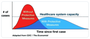
In the article, creator Drew Harris mentions he wished he?d spend more time on the slide and that he wasn?t a graphic designer. Given how effective this graph is, I beg to differ ??? you don?t need to be a graphic designer to make an image do its job.? This illustration did exactly what any data story needs to do ??? it brought attention to a problem and got people aligned on a solution.
This diagram has become the defining rallying cry behind the ?flatten the curve? movement and many have continued to enhance the chart so that the story can stand alone. In its initial incarnation, it requires thought and perhaps even a quick Google search for more information to fully get it, but with the enhancements different organizations have applied, we can see the application and benefit of POET on the Page.
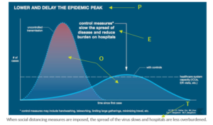
In this particular chart from PBS, you?ll see they used the same image ??? the data (the O in POET) is the same. And the visual is good, but the image itself isn?t what makes this a stand-alone story. It?s clarity of the purpose communicated through the title, attention to what matters in the data (colour transition at the peak of uncontrolled transmission) and, most importantly, effective use of text (added commentary to translate the data into language relevant to the reader.) You?ll see the same technique in slides from the Globe and Mail, CBS, Visual Capitalist, or this excellent compilation from Fast Company, which also includes some guidance on visualization.
Stand-alone data stories ??? those that can be confidently circulated on their own ??? apply the principles of the POET TechniqueTM through title, colour and commentary. You don?t need to be a graphic designer to tell a story through data. (Harris proved that, in spades!) You just need to mine the right story from your numbers and present it in a way that allows the audience to take it in and understand at a glance, without extra research or explanation.
As we dive headfirst into the world of remote work, our ability to connect with audiences, to share our insights, is going to be one of the most important skills we need to develop. Start strengthening your stories through the POET TechniqueTM, and keep in touch with us for more tips in the weeks to come.
Join us for one of our POET Fundamentals webinars to learn more about how POET is used to connect with your audience and deliver an impact ??? even (maybe even especially) if you?re not in the same room. To help you through work transitions driven by COVID-19, we?re offering these webinars frequently and for free in the month of April.
Until then, keep washing your hands and we?ll see you soon.
?I recently had an opportunity to attend one of Laura?s Storylytics sessions where I was introduced to the POET Technique. Thinking this was simply a ?tool? you would use from time to time, I soon realized this unique process would revolutionize how I approach every Executive email, PowerPoint slide and consultative discussion with our Credit Union Partners. After working with Laura and putting POET into action through a series of discovery meetings with a large Credit Union, they stated the meetings exceeded their expectations. Thank you, Laura!?
–L. Rota, Strategic Account Executive, CUMIS