
I’ve talked to a lot (a lot) of executives about what they need from their data, and the consistent theme is this: Tell me where I need to focus my attention.
That’s it. It’s that simple and that difficult all at the same time.
The statement is simple because it offers an easy way to spot-check your work � does what I’m sharing bring focus to what’s next. But it can also be extremely difficult. There are so many options in the analytic toolkit to shed light on the business, it can be hard to know where to start, let alone when to stop. Some applications can’t deliver on their promises, while other approaches are undervalued in terms of what they offer.
In my opinion, the humble dashboard is one of these undervalued tools. While it’s true that a dashboard doesn’t go far enough (not by any stretch!) to deliver earth-shattering kabooms of insight, it doesn’t mean they’re devoid of value. In fact, it’s the opposite. A dashboard is the starting point for many investigations.
Reframing common dashboard frustrations
Two common “Ugh, dashboard!” frustrations I hear need to be addressed before we can get to how we deliver value through a dashboard: self-serve and dashboard volume.
Up first � self-serve.
I often come across the creation of self-serve (also called self-service) dashboards, which are designed to give users easy access to the answers they need when they need them. As much as I have personally benefited from these capabilities, there is an often-unspoken assumption that goes along with their use. That assumption: Data literacy of the user. In my experience, this tends to be the unfortunate sticking point.
Self-serve really only works in a data-literate environment � where the user knows how to leverage the dashboard as a way to focus attention. If you’re in one, great! Skip ahead to the next point. If you’re not, let’s briefly pause.
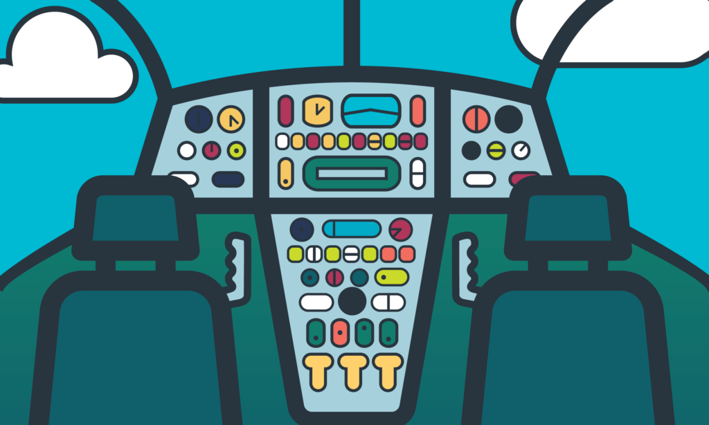
Dashboards, in their time-honoured definition, provide a glimpse of the key levers of a business. It’s similar to the dashboard in an aircraft. The dashboard display provides an at-a-glance look at the key technical operations of the plane. A pilot is looking for exceptions and early indications of issues so that they can get back on track before anything becomes a major problem. A non-pilot would be overwhelmed because everything looks important. They need guidance on where to look (not to mention help on avoiding a crash!).
Where data literacy is low, self-serve dashboards are the equivalent of asking non-pilots to navigate the controls. There’s just too much information all at once � for those who aren’t data literate, it’s impossible to know where to focus (and you know that can’t be a good thing when you’re flying a plane!).
Which brings us to dashboard volume.
Social psychologist William Bruce Cameron said, in 1963, “Not everything that counts can be counted, and not everything that can be counted counts.”
Sixty years later, this is still an incredibly relevant statement � especially when you’re talking about dashboards.
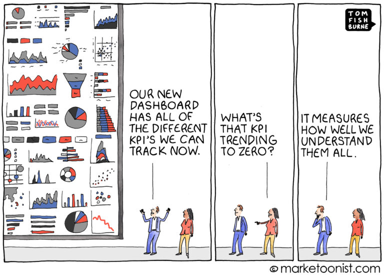
In today’s dashboard world, volume does not equal value. Just because something can be standardized does not mean it should. Good dashboards are organic and help focus the business (unlike this funny-because-it’s-true Tom Fishbourne KPI cartoon).
The unfortunate thing is that, in high volume environments, those who issue the dashboards start to feel stuck when the volume starts to feel like white noise, and like they’re saying the same things week after week. Even worse, this slog can’t provide focus and makes everyone wonder about the value of the dashboards altogether � plus, it can be extremely demotivating to those who are writing the commentary.
Well, I’m here to tell you that the problem isn’t the dashboard. Stories can be told from dashboards, if you can just rethink how and why you share those stories.
Providing focus a distracted world
Leaders rely on data storytellers to tell them where to focus their attention (especially since so many things compete for their attention every day). In practical terms, this means “tell me what I’m not already aware of and how it’s going to have an impact � positive or negative � on our ability to achieve our goals or objectives.”
The purpose of � and opportunity in � dashboards is to identify where we need to focus our efforts. The findings don’t all need to be gamechangers; at this stage, they simply need to identify the forest from the trees.
Observations are led by exception
With a clear purpose, now we turn to the data points themselves.
When presenting or writing commentary from a dashboard, remember that dashboards are intended to highlight exceptions � to put a spotlight on areas that need our attention, in order to help us stay on track. (Huh. That kinda sounds like what the executives are asking for.)
Stay tuned for part two in praise of dashboards coming soon!
Interested in discovering the story waiting to be told in your dashboards? Get in touch and let’s have a chat.