
It’s the return of the dashboard! In part one of Don’t Diss the Dashboard, we discussed why dashboards get a bad rap. If you haven’t read the first part, go back and give it a look to get even more out of this article. In part two, we’re picking up where we left off, exploring more about how the story of the dashboard is led by exception.
What’s an exception?
If we take a step back and consider what we’re really looking for in a dashboard, it boils down to this: looking at recent history to identify trends that deviate from expectations. We expect to be meeting our KPIs. We expect that our product innovation is driving volume. We expect that our outbound campaign is bringing in new leads. A standardized report of the data allows us to see, at a glance, how we’re “doing.”
Assuming we know the intended outcome of a dashboard, now we’re in a position to have a story to tell. And there are a two success factors in developing that story � knowing where the exceptions are, and knowing how to highlight the story to others.
Stories are found in exceptions
Early in my career with Nielsen Market Research (now NielsenIQ), my fellow analysts and I were responsible for monthly “trend checks.” Essentially, we were combing data to look for oddities that may point to data quality issues. While technology has made this process obsolete today, it was an excellent lesson in the importance of the big picture.
Successful trend checks were dependent on our understanding of category dynamics and planned activity. Only then could we confidently decide if changes in momentum (or lack thereof) needed attention, or if we were looking at indicators of a developing story.
This experience extended to understanding differences in expectations as well. Case in point: While working with a well-known food production company, a now-popular product was launched and, at first glance, appeared to be performing really well, surpassing all of our benchmarks for success. Imagine our surprise when we were met with disappointed faces when offering congratulations on the launch results.
In probing to understand the response, we learned that the team had set their launch targets exceptionally high � much higher than we would typically expect for the category � and we weren’t in the loop. Knowing that expectation completely changed the tone of the story that needed to be drawn from the data, and our subsequent delivery.
Many years have passed since I held those early positions in-house, but little has changed in terms of how important it is to understand expectations. Calling out exceptions is what makes for meaningful observations and sets leaders on the right path towards were a story lies. It’s a success criteria I can’t imagine will ever disappear � keeping on top or ahead of a rapidly changing market is a critical success factor in business, and it’s getting more important every day.
Drawing the story out of your dashboard is easier than you think
Mocking dashboards sometimes feels like an easy laugh in the vein of “funny because it’s true.” A quick Google search will reveal a wide selection of dashboard cartoons calling out their (dubious) use.
While I love a good Marketoonist as much as the next person, there is an important truth that must be understood: Every dashboard, even a crummy one, can surface a story if you understand the assignment.
Leaders are looking for exceptions in two categories when reviewing a dashboard:
- Big and important: Tracking against key performance metrics for the business as a whole (i.e. are we on budget?) and important initiatives underway (i.e. project status, new launch.) Are we on track to meet objectives? If not, what’s the momentum and why?
- Difference or change: Beyond the major initiatives, every business operates on an expectation of what the market is doing around them, from competitive influence, to consumer or market behaviour. Notable deviations could signal emerging opportunities or risks that the business needs to have on their radar screen.
When we look at dashboards through the big and important, difference or change lenses, suddenly a static, routine report becomes a vital tool in rapidly identifying stories.
Don’t let the findings get lost in the day-to-day grind
Now that you have a new perspective on the value of the dashboard, don’t let it go to waste. A data storyteller has an opportunity to shine a spotlight on the stories whenever a dashboard is issued (particularly to senior leaders, where competition for attention is high.) Add exception commentary by first speaking to big and important items, then addressing differences or changes. These provide the first indication as to where the stories lie, giving direction for the story to come.
Dashboards work best when the purpose is clear
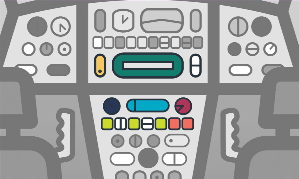
In part one of our dashboard two-parter, we compared dashboards to airplanes. For those without a storytelling lens, a dashboard is basically gobbledygook. It would be like sticking an untrained person in the cockpit of a 747 and telling them to hit the skies. Neither scenario � attempting to provide necessary, targeted information to decisionmakers, or getting the plane to its final destination � is going to end well.
In the same vein, a dashboard in the hands of someone who knows what they’re looking for stands a far better chance of moving the needle in a business. This is where the dashboard cartoons actually resonate. For those who don’t know how to find the information senior leaders need and want, all of the jokes apply.
The good news is, I can help you to learn how to discover the stories in your dashboards. Get in touch to learn more.